How to Create a Premium Interior at Home Without Big Costs
There’s always that itch. You walk into a hotel lobby or a glossy apartment feature and the place just feels expensive. But at home, unless you’re spilling money like water, it seems impossible. The truth? You can fake “premium.” Not fake in a bad way. Fake like you learn the moves, play them right, and suddenly your two-bedroom flat looks like it belongs in an editorial spread.
I’ve done it. I’ve stumbled through mismatched furniture, weird lighting, and floors that screamed “rental.” What changes the vibe isn’t money—it’s intention. Layers, material choices, a few things upgraded with care. And knowing where to stop.
Layering Space, Not Just Stuff
Premium spaces rarely feel cluttered. They feel balanced, each zone carrying its own voice. One underrated trick is working with space zoning. By shifting how you place a sofa or rug, the room suddenly divides itself into meaningful areas: lounge, dining, a corner that becomes an office nook. Not walls, not heavy dividers—just clever lines.
I once shoved my couch off the wall (risking chaos in a tiny room). Boom—instant divide between “hang out” and “eat.” That one tweak, no shopping involved, raised the game. Throw in a rug that defines its own territory and you’ve made the air itself feel structured.
Materials That Talk Back
Expensive interiors whisper through texture. Not shouting, not shiny overkill. Wood, stone, raw fibers. You don’t need to panel an entire room—small gestures can do the heavy lifting. Think side tables in natural materials like oak or marble. Even a simple linen curtain diffuses light in a way plastic blinds never will.
Some designers push sculptural elements into everyday life—oddly shaped lamps, curved stools, bowls that look like art. These aren’t about function first. They’re presence, silhouette, shadow. You don’t need dozens. One strong object, and people feel the intention.
The Myth of New
Here’s the secret: premium doesn’t mean “latest release.” It can be vintage furniture. It can be second-hand. What matters is how it sits in your room. The alignment, the context. I saw a project where a timeworn wood cabinet stood beside clean, modern cabinetry. It didn’t feel like a yard sale, it felt curated. Like the old piece was chosen, not inherited by accident.
Premium is editing. You can have the most expensive chair—but if it’s dumped next to a cheap plastic lamp, both lose. Strip down. Make each piece count.
The Glow Matters More Than the Object
If there’s one area not to skimp, it’s light. Overhead glare ruins everything. A $20 lamp in the right corner can look worth $200 if the glow is warm and directional. Try clusters: a floor lamp, a table lamp, maybe a pendant. Suddenly the room shifts moods as you flick switches.
Good lighting can create cozy corners even in open spaces. It’s like sketching with shadow. The money goes further here than anywhere else.
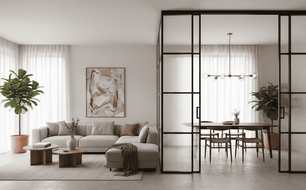
Transparency with Weight
Walls crush flow. But full openness? Cold, echoey, unfinished. There’s a balance. Glass is the trick. Insert a partition, but make it frameless glass so light passes through and rooms keep their airiness. You get privacy without killing energy.
I’ve seen homes where sliding panes replace heavy construction. They shift, disappear, reappear. Imagine a small apartment that turns from one big studio into multiple rooms depending on mood. That’s premium—not price tags, but flexibility.
FFunction Without Shouting About It
Premium isn’t about excess—it’s about precision. That marble island in the kitchen? Not screaming luxury, just quietly defining the space. The sight lines connect kitchen, dining, lounge. One gesture controls the flow.
Think about it this way: expensive spaces don’t need to prove themselves with giant chandeliers or gold accents on every surface. They work because the structure of the room itself feels intentional. The way you can see from one end to the other without bumping into awkward furniture. The way light travels across surfaces without being blocked by random clutter. That’s premium. That’s design doing its job in silence.
You can mimic this. Even open shelving can create visual pauses. A bookshelf set against a pale wall isn’t just storage—it’s a divider, a rhythm. It slows your gaze, gives the room a tempo. Premium homes often rely on rhythm more than decoration. A corridor that opens into a wide kitchen. A sofa that aligns perfectly with the center of a window. Subtle alignments that your brain notices, even if you can’t articulate them.
Don’t underestimate functional hubs—corners where work and play coexist without fighting. A desk built into a niche, hidden away, yet close enough to the lounge area that you don’t feel exiled while working. Or a reading chair tucked under the stairs with its own lamp. Precision isn’t about perfection; it’s about finding balance so the room feels like it was planned, not just thrown together.
And when you get it right, people might not say “wow, that’s expensive.” They’ll say something simpler: “this room feels good.” That’s the compliment you’re after.
When Small Accents Do the Work
There’s a cliché: you get what you pay for. Sometimes, sure. Other times, no. You don’t need to replace the whole kitchen. Swap cabinet handles. Upgrade the faucet. Lay down one rug with bold pattern. Little things warp the whole perception.
That’s the beauty of accents. They’re cheats. They let you sidestep the huge costs while giving people the impression of transformation. A basic flat-front dresser with the right brass pulls suddenly looks like it belongs in a boutique hotel. A plain bathroom feels polished when you replace the mirror with one that has a sculptural frame. It’s not about the price tag; it’s about the story the detail tells.
Even small accents, for example, decorative glass solutions, can give the space a stylish and expensive look. Light hits differently, reflections dance, and suddenly the room breathes a new story. You don’t even notice the cheap flooring when your eye is distracted by how the glass catches the morning sun. This is psychological design: distract the eye with beauty so it doesn’t linger on flaws.
Think of textiles too—pillows, throws, curtains. They’re the easiest accents to rotate and refresh. A velvet cushion on an otherwise ordinary sofa makes it seem far more intentional. A linen throw tossed (but not too perfectly) over the side of a chair whispers “comfort, but make it chic.” Even a cluster of candles on a tray can add instant atmosphere.
The trick is restraint. Too many accents and you’re back in clutter-land. But a few, carefully chosen, act like punctuation in your story. They make sentences in the room sharper, more dramatic, more alive.
Keep It Personal
Here’s where many people lose it. They copy Pinterest boards and end up with soulless perfection. Premium is not sterile. It’s lived in, but thoughtfully so. Your grandmother’s painting in a sleek frame. A stack of records near the modern speaker. The rug from a flea market that pulls colors out of your sofa cushions.
What breaks the illusion is randomness. What builds it is consistency. Keep your palette restrained—three or four main tones. Then let personal artifacts sneak in without blowing the vibe. A photograph in black-and-white looks intentional on a minimalist shelf, even if it’s just you and your dog. A worn leather chair, polished and placed right, feels like character, not clutter.
The secret is editing. Don’t put everything you love on display. Curate it, like a gallery. Rotate objects in and out of sight. That vintage vase you bought on a whim? Bring it out for a season, then tuck it away and let something else shine. When people see your space, they should feel your personality—but filtered, distilled, like a best-of playlist rather than the entire discography.
And don’t underestimate the emotional punch. A house without personality is just walls and furniture. But one where each corner tells a story? That’s unforgettable. The coffee mug you brought back from a tiny street stall in Lisbon, the old typewriter from your uncle’s attic, even the slightly battered guitar leaning casually against the wall—these things ground the design, remind everyone it’s not just pretty, it’s yours.
In the end, personal touches are the difference between a room that looks “expensive” and a room that feels priceless. And trust me, people notice the difference, even if they can’t put it into words.
Tricks I Swear By
- Don’t line furniture along walls like you’re in a doctor’s office. Float it.
- Texture beats shine. Gloss scratches, natural fibers age gracefully.
- Replace plastic. Anything. Chairs, bins, lampshades—plastic screams cheap.
- Edit constantly. If an object doesn’t belong, move it or toss it.
- Play with height. A tall plant beside a low sofa stretches the eye.
- Hide cables. I can’t stress this enough. Exposed wires kill any luxury.
Wrapping the Room in Story
Premium is less about money, more about narrative. What’s the story your space tells? Minimalist calm, rustic warmth, urban edge. Stick to one, commit. People feel when a place is cohesive—even if they can’t name it.
I walked into a home once: concrete walls, steel shelving, soft rugs on the floor. Brutal yet warm. That mix? Unforgettable. It wasn’t expensive. It was coherent. Let your choices orbit around simple principles—coherence, restraint, and sustainable design.
That’s the challenge: make your home more than a collection of things. Make it speak.
FAQs
Q: What’s the cheapest upgrade that instantly feels premium?
A: Lighting. Swap harsh overheads for layered lamps, and the entire room changes mood.
Q: Do glass partitions make small apartments look bigger?
A: Yes—transparency keeps light moving, avoids boxed-in walls, and adds flexibility.
Q: How do I avoid making a space look staged?
A: Restraint with palette, but freedom with personal details. A few authentic touches ground the room.
Q: Is vintage furniture really premium?
A: When chosen with care, absolutely. Context makes old pieces look curated, not random.